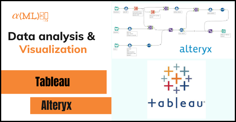
Creating Beautiful Maps with Alteryx and Tableau
Maps are a powerful tool for visualizing and understanding spatial data. They allow us to see patterns, trends, and relationships in our data that may not be immediately apparent in tabular form. In this blog, we’ll explore how to use Alteryx and Tableau to create beautiful, interactive maps that can help you make better data-driven decisions.
Before we dive into the details, it’s important to note that there are many different ways to create maps with Alteryx and Tableau. In this blog, we’ll focus on two specific approaches:
- Using Alteryx to geocode and prep your data, and then using Tableau to create the final map visualization.
- Using Alteryx and Tableau together to create dynamic, interactive maps that allow you to drill down into your data and see more granular details.
So let’s get started!
Using Alteryx to Geocode and Prep Your Data
 The first step in creating a map with Alteryx and Tableau is to geocode your data. Geocoding is the process of assigning latitude and longitude coordinates to your data based on a specific location. This is important because Tableau (and most other mapping tools) requires latitude and longitude coordinates in order to plot data on a map.
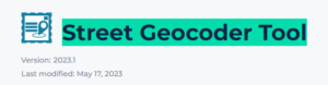
There are a few different ways to geocode your data in Alteryx, but one of the easiest is to use the “Street Geocoder Tool” tool. This tool allows you to input a list of addresses, and it will output the corresponding latitude and longitude coordinates.
To use the “Street Geocoder Tool” tool, simply drag it onto your canvas and connect it to your input data. Then, specify which field in your data contains the addresses that you want to geocode. Once you’ve geocoded your data, you may want to do some additional data prep in Alteryx. This could include things like cleaning and standardizing your data, aggregating it to different levels (e.g., by city, region, etc.), or performing calculations on it. The specific steps you’ll need to take will depend on your specific data and use case.
Once you’ve finished preparing your data in Alteryx, you can then output it as a .csv file and bring it into Tableau to create the final map visualization.
Using Tableau to Create Beautiful Maps
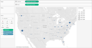
Once you’ve brought your data into Tableau, you can use the built-in mapping capabilities to create a variety of different map types, including point maps, heat maps, choropleth maps, and more.
To create a map in Tableau, start by dragging the “Latitude (generated)” and “Longitude (generated)” fields to the “Columns and Rows field” and drag country or regions field to details Marks. This will create a point map, with each data point plotted at the corresponding latitude and longitude coordinates.
You can then customize the appearance of your map by changing the map type (e.g., standard, satellite, terrain), adjusting the zoom level, and adding map layers (e.g., borders, labels, etc.). You can also customize the appearance of the data points themselves, by changing the color, size, and shape of the marks.
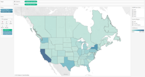
One of the most powerful features of Tableau is its ability to create dynamic, interactive maps. By using filters and parameters, you can allow users to drill down into your data and see more granular details. For example, you could create a choropleth map that shows the distribution of a certain metric (e.g., population, income, etc.) at the state level, and then allow users to filter the map by region, year, or any other relevant dimension.
To create an interactive map in Tableau, start by dragging a dimension (e.g., state, region, year) to the “Filters” pane. This will create a dropdown filter that allows users to select the specific values they want to see on the map. You can then use this filter to dynamically update the data displayed on the map.
Another way to create interactive maps in Tableau is to use parameters. Parameters are variables that users can change to alter the data displayed on the map. For example, you could create a parameter that allows users to select a specific year, and then use that parameter to filter the data displayed on the map.
 Creating Beautiful Maps with Alteryx and Tableau: Tips and Best Practices
Here are a few tips and best practices to keep in mind when creating beautiful maps with Alteryx and Tableau:
- Make sure your data is clean and accurate. Before you start creating your map, take the time to clean and standardize your data. This will help ensure that your map is accurate and easy to understand.
- Use appropriate map types and visualizations. Different map types and visualizations are better suited for different types of data and use cases. For example, a point map may be appropriate for showing the locations of specific events or points of interest, while a choropleth map may be better for showing the distribution of a metric across a geographic region.
- Use appropriate map scales. Make sure that the map scale is appropriate for the data you are visualizing. For example, if you are showing data at the state level, you don’t want to zoom in too far, as this will make it difficult to see the overall patterns in your data. On the other hand, if you are showing data at the city level, you may want to zoom in closer to see more granular details.
- Use appropriate map layers. Map layers can help add context and clarity to your map. For example, you might want to include map layers that show country or state borders, city labels, or points of interest. Just be careful not to overdo it, as too many map layers can make your map cluttered and difficult to read.
- Make your map interactive. By allowing users to filter and drill down into your data, you can create more engaging and interactive maps. This can help users better understand and explore your data, and can make your map more useful and valuable.
Conclusion
Creating beautiful maps with Alteryx and Tableau is a powerful way to visualize and understand spatial data. By using Alteryx to geocode and prep your data, and Tableau to create the final map visualization, you can create dynamic, interactive maps that allow you to explore your data in new and meaningful ways. Whether you’re a data scientist, a business analyst, or just someone with a curious mind, using Alteryx and Tableau to create maps can help you see the world in a whole new way.